Jan 02, 2024
2024 Key Market Outlook
Jeonghyeon Lee
Joachim Klement is an investment strategist based in London whose steady stream of investment-related blog posts and publications has drawn considerable attention. As 2023 came to a close, Klement wrote what he called his last “serious” post of the year on his blog, explaining the most common chart errors you see in investment reports and on social media. As we head into 2024, we thought it would be helpful to keep these points in mind when investing, so we have provided a brief translation.
This article is a translation of Joachim Klement’s “What Will 2024 Bring?” with the author’s own thoughts added.
This is probably going to be my last serious post in 2023. Of course, there will be the traditional Christmas edition, but if not, I will be back in January 2024. Before I sign off, I want to write about one of the most common chart errors you see in investment reports and on social media.
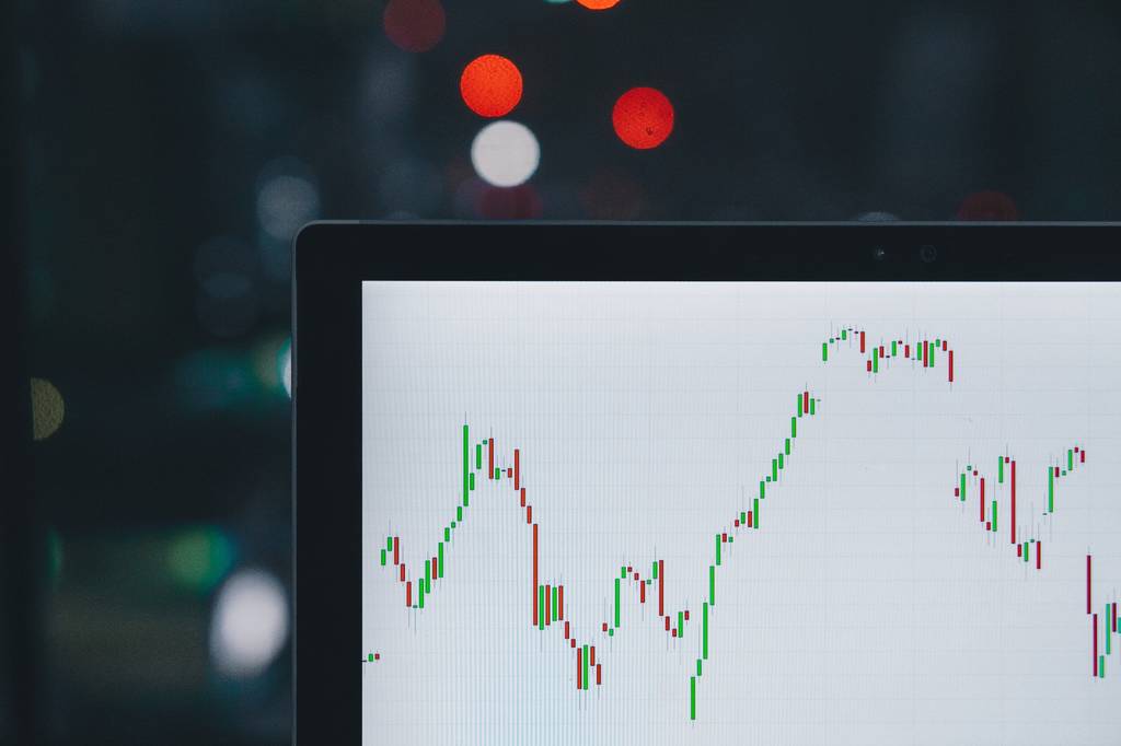
Most people have seen charts that compare today’s market with a past market, where the last six to twelve months line up remarkably well. The historical pattern is then extrapolated into the future to predict that this time, too, the market will move in a similar direction. For example, a chart like the one below suggests that the first half of 2024 will be a very good period for the S&P 500. In fact, the correlation between the 2017/2018 S&P 500 and the 2023 S&P 500 is as high as 92%, and in the six months after the overlapping period ended, the market rose by almost 10%.
If you think about it, today’s situation looks very similar to 2017/18. After the Fed raised rates from near zero, the US economy was expected to slow. Many economists also predicted a recession in 2018 or 2019, but while the US economy did slow, it remained surprisingly resilient and avoided a recession. That was quite a surprise and led to a rally in the stock market in 2018. That is why many economists today are once again surprised by the strength of the US economy despite the large rate hikes.
Or think about the analogy with the economic situation in 1997 shown below. At the end of 1997, the so‑called Asian tiger economies, which had been hailed for decades as growth miracles, began to wobble. Imbalances in foreign exchange reserves raised fears that these countries might have to devalue their currencies. Foreign investors quickly pulled out their money, accelerating the crisis and causing major problems in global bond markets. Today, another Asian growth story of the past few decades is faltering. China is desperately trying to prevent a collapse in its property sector, but if it fails, the impact could spill over to other Asian markets and to the creditors of struggling property developers.
But this is all bullshit.
I made it all up. What I actually did was build a system that looks at the recent history of the S&P 500 and then goes back to 1964 to select the periods with the highest correlation. The segments I was looking for had to have as high a correlation as possible with 2023 and see the market rise by more than 5% in the six months after the overlapping period ended.
Once I had the charts that fit those criteria, I simply racked my brain (and used Google) to come up with plausible analogies between the current episode and the past ones. Thanks to my system, I already knew that the correlation between the current and past markets would be very high, and that these analogies would show a strong market rally during the overlapping period, so constructing the narrative was no problem.
To show just how useless these historical comparisons are, I used the same system to find two more periods to compare—this time selecting those with the highest correlation during the overlapping period where, after that overlap ended, the past stock market fell by at least 10%.
The first chart below compares the S&P 500 in 2023 with the situation in 1970/71.
In the chart above, the correlation between the present and that period is also 0.92, exactly the same as the correlation between today and 2017/18. In 1970, inflation, which had surged in 1969, came down thanks to the Fed raising rates to 9%, the highest level in 30 years. Naturally, these rate hikes weighed on economic growth and corporate profits, putting downward pressure on the market. On top of that, public discontent over the Vietnam War peaked, leading to large‑scale protests such as the Washington march in April 1970, and that spring saw an increase in terrorist attacks by anti‑war activists. If you simply swap out the Vietnam War for the climate movement, you get a suitably bleak scenario for today.
Or think back to 2007, when Fed rate hikes triggered a downturn in commercial and residential real estate that ultimately led to the 2008 financial crisis. In late 2006 and early 2007, we thought the property market problems would be confined to some corners such as subprime mortgages (I thought so too). But the crisis did not stop at the subprime mortgage market; it spread.
Today, we worry about US commercial real estate in cities like LA and assume the market will correct itself, and that these problems will not spread into a major banking crisis. Oh, and did I mention that in July 2006 there was a war in Israel, when Israel bombed Hezbollah bases across Lebanon and imposed a blockade on the country?
No matter what point you want to make at any given time, it is very easy to create these suggestive charts. Thanks to my system, I was able to produce two bullish and two bearish charts in just a few minutes, and with a couple of Google searches I could also come up with plausible explanations.
But the fact that these charts are suggestive does not mean they should be taken seriously. The lesson you should take away from this article today is that you should completely ignore all such charts, wherever and whenever you see them. They are meaningless and are most likely the result of extensive data mining by someone who wants to talk their own book.
Above all, remember that predicting the future is hard. With basic research and analysis, you can sketch out plausible scenarios, but the uncertainty always remains high. Forcing one chart to fit another is not research, and it cannot serve as a basis for investment decisions. If you put money to work based on these kinds of charts, you should be prepared to lose that money.
Newsletter
Be the first to get news about original content, newsletters, and special events.
Continue reading

Note By Ryunsu
The Intelligence Layer of Financial Infrastructure
Ryunsu Sung

Aware Original
Why Bitcoin Keeps Falling: The Downward Spiral of the Gamma Trap
Ryunsu Sung

Aware Original
The Overwhelming Autonomous Driving Leader Proven by Numbers: Waymo’s Full-Scale Takeoff
Ryunsu Sung

Aware Original
The Precarious State of ‘American Exceptionalism’ and a Shaken Dollar Hegemony
Ryunsu Sung